Qmpela 2.0
My role: UX/UI Designer | Product Designer
Project Golas and Design Challenge
The web service I was tasked with redesigning aimed to support leasing and loan sales within the external sales chain. However, the initial version fell short of expectations. Salesmen struggled with its usability, finding it cumbersome and time-consuming to issue offers to customers.
Six months after the initial release, there were less than 50 active users, significantly below the expected minimum of around 600 users within the first month.
I had to figure out why the first version didn't work and then redesign it to better suit what the users needed.
UX Research
The redesign process was started from UX Research which we hoped will let us understand what exactly is wrong with the product.
The research goal was to find answer for the following questions:
what is the salesmen work-flow and what are the most important aspects of their work with customers,
what are they requirements for sales support services,
what can be done to improve the salesmen experience with the service to make it preferable solution.
Methods utilised in the research:
Participant Observation - conducted to understand how salesmen work and what is important for them,
Interviews (IDIs) - for gathering ideas and deepen understanding user’s needs,
Shadowing - focused on gathering qualitative feedback from current solution,
Desk Research - aimed at similar services and applicable solution.
Findings
Salesmen struggle to determine earnings during customer interactions, lacking real-time calculations.
Existing solutions limit issuing multiple offers simultaneously, causing repetitive processes.
Salesmen seek timely updates on offer status for prompt customer communication.
Slow contract processing leads to delayed signings.
Inconvenient small font size affected usability of the solution.
Redesign process
The redesign started with listing all improvements/features the team has to work on. The list was as follows:
Dashboard - a central point where salesmen can view all pending, canceled, closed or drafted offers they made and manage them easily.
Tablet ready layout - the design has to seamlessly adaptable for desktop and tablets.
Ease of use - the new flow of issuing an offer has been aligned with the way and in accordance with order in which salesmen gather information from customer. This way information can be attained more naturally though a regular conversation.
Quick navigation - for desktop version all inputs were organised in a wat that user can easily switch to next input by clicking “Tab” button.
Earning calculator - a feature allowing user to know exactly how much money he /she will earn from the contract depending on contract parameters and add-sale products.
Easy scanning - the service should have built-in support for digital scanning when on tablet.
Improved workflow - all the pages and inputs should be organised in the order salesman usually obtain information while talking with customer.
Notifications - providing information about any change in any offer status.
Smart default - many inputs and drop-downs were filled with predefined values. For example:
salesman doesn’t have to browse through all car brands because his selection was always limited to brands he work for,
same as selection certain type of asset determined inputs like asset category and subcategory,
after initial verification inputs were already filled with customer details uploaded from data center.
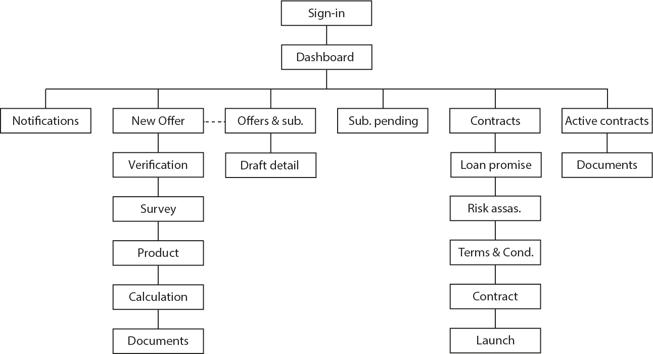
Information architecture
We streamlined the architecture to two levels for a smoother mobile experience. The service centers around a dashboard, allowing users to control offer status and use a simplified offer creation module. This hides complexity, creating the illusion of only two levels.
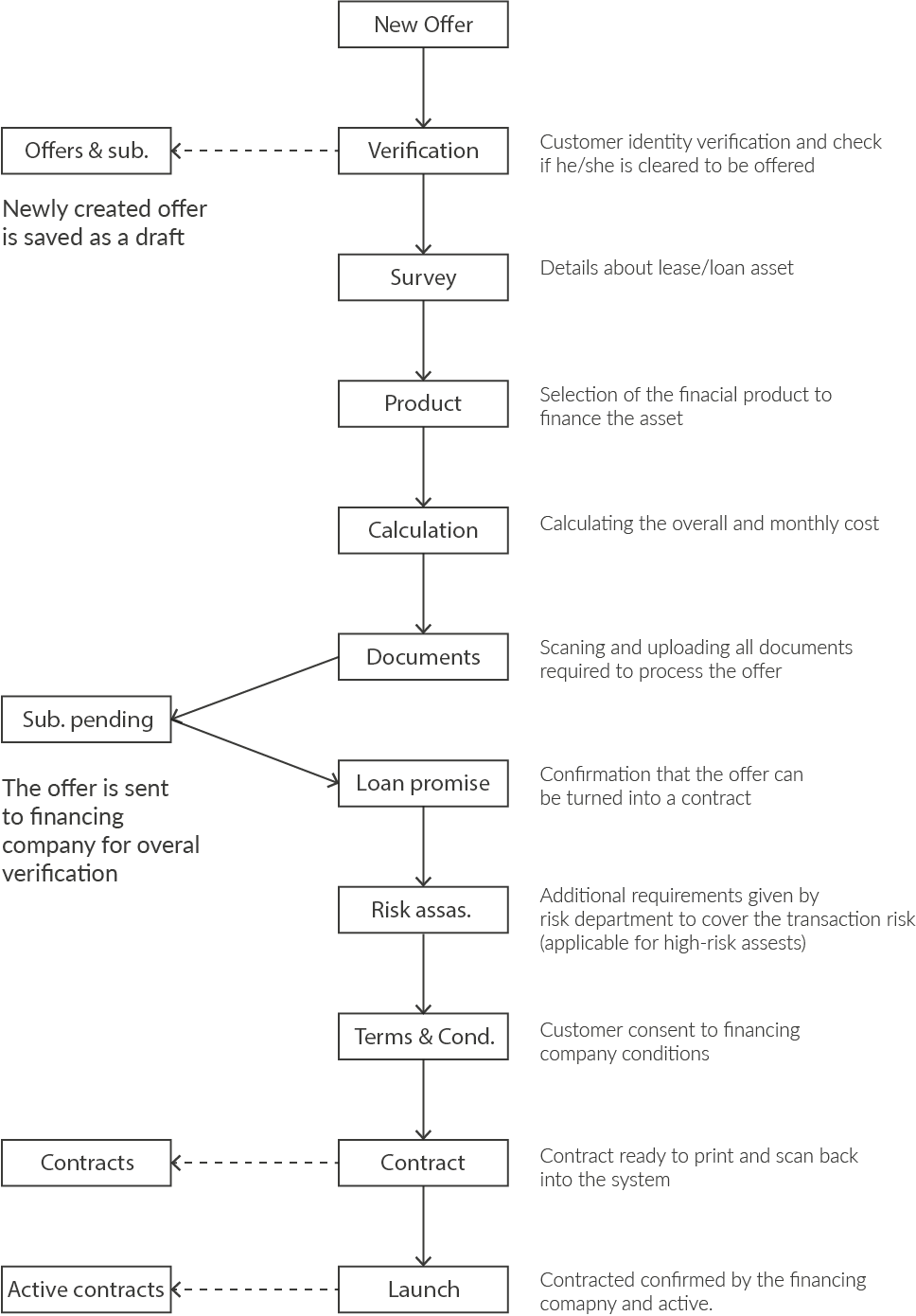
New Workflow
The most significant change compared to the first version of the service was the enhanced workflow, designed to align seamlessly with the natural conversations salesmen have with their customers.
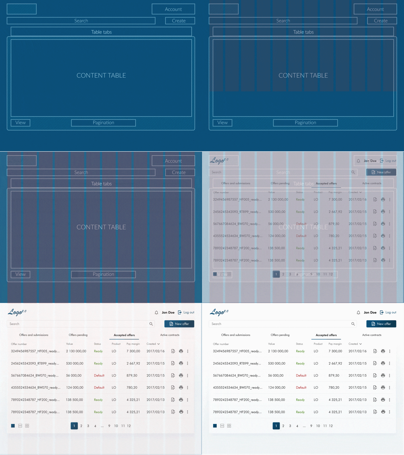
UI Design
The UI design process was significantly influenced by the initial requirement for the service to be clear and visible. This led me to choose the Futura/FuturaHV font, known for its text readability and the appealing appearance of numbers.
Final Design Sample
Result
The redesign of Qmpela 2.0 successfully transformed it into the go-to tool for its intended users. The project addressed various issues identified during UX research, with key improvements including:
Introduction of a calculator displaying exact earnings for salesmen.
Service enhancements, reducing the time to issue an offer to an average of 3 minutes and contract signing to approximately 15 minutes.
Direct scanning of documents from the salesman's device became possible.
Streamlined offer processing, providing salesmen with clear insights into the status of their pending contracts.
The revamped solution has gained popularity, with around 4000 active users utilizing it every week. The internal sales department also appreciates its user-friendly nature, opting to use it frequently despite having access to other sales tools and CRM systems.


